Wednesday, 9 October 2013

ELEMENTS OF A STORY IN STORYBOARDING

WEEK 6 DAY 2

After a brief on what elements make up a story from beginning to end involving struggle and the final resolution; we had to sketch out a few characters and settings. These characters were referenced from strong characters that each person had come across in their lives.

The settings had to represent a dream escape, a time of sadness and excitement individually. We later used these characters and settings to create our own stories.

These are some of my own sketches, they were done at speed but I feel I captured the essential characteristics to bring them to life.

It is interesting looking at other peoples drawing styles and how lines are made differently, these sketches were done by another group member within the task.

These are the 3 horizontal storyboards for the 3 short stories my group created. The task involved doing the storyboard over our original sketches creating a busy by contextually relevant scene.

This is part of story 3 involving a crazy cyclist cycling around with hands off the handlebars on a skate park 'half pipe' with his dog in a basket on the back of bike. The problem is when his dog runs away and then he becomes depressed; but when he sees his dog happy with a new family he is happy for his old dog and realises he is better off without him so they go their individual ways and both individually do what they enjoy. 

This shows two scenes from a story; here Sonic runs so fast he breaks the treadmill machine at the gym and in doing so he injures his leg so he ends up in hospital worrying about all the people he is now unable to save, then along comes his compensation money for the damage caused to him at the gym.

This shows two scenes from a story where here the chicken is on the rollercoaster but the seatbelt is not fastening properly!

The combination of past sketches and new storyboard sketches provides an interesting set of layers in the eye of the viewer.

Storyboard combined with: happy setting, nightmare...

We also carried out a quick animation sequence involving moulding a ball of blue-tack into shapes stretching them then filming in between to show the gradual change in shape or movement of the created form. At the end all these small frames were combined into one much larger and longer film. The following images are some random snapshots from the final film. 


REFLECTION
This was a very interesting day in that it really opened my mind on how to create a story and how simple it is following a simple formula in order to generate a story with a real meaning a sense of profoundness to it. I feel that I am getting used to expressing my imagination well with pen on paper but I could still improve much. The storyboard was created amongst our group efficiently and successfully in my opinion considering the small time period we had to complete it in. If we had much more time I'm sure we could produce something quite special. Also I was impressed how easy the blue-tack animation was and am keen to investigate that technique some more (it reminded me of a Wallace and gromit film which I admire a lot). The idea of doing a rough storyboard on top of the original sketches was thought provoking but I think its too much of a messy idea to use again; next time I make a storyboard I will be much neater and clearer so the images are less rough and more understandable as to what they are actually showing in order for the storyline to be obvious. Overall I am proud that I worked well in a group raising my voice so that it was heard and so that we created final produce as a group quickly and fairly successfully. Ideally I would like to work at this efficiency throughout the rest of my work whilst always working out ways to improve and avoid time wasting problems along the way.
 
Images: Authors own
 
CHC


Monday, 7 October 2013

PHOTOGRAPHY BASICS

WEEK 6 DAY 1

I took many photos based on places of memory, preceding to this day of photography at Ravensbourne. Out of all of the photos I liked this one the most because of the cinematic effect it creates through the panoramic lens.  I found it to be the most interesting composition out of all of my photos because it was not definitely a perfect scene with some mysterious disfiguring and generally there is so much going on in this scene.

I redrew this image in a 45 minute time period on a much larger scale than I have ever done before in pencil, I used 3 lots of A2 paper to create enough length to draw out this panoramic scene. Its not perfect because it was carried out at speed but I have managed to note down all features from the original picture.

Here is a quick sketch of the figures of me and my brother in the mirror. Here we were looking into the context of cropping and selecting certain parts of the image to give the image a whole new meaning to the original.

This cropping of the image shows a cartoon ducks face smiling and this is clearly a completely different atmosphere compared to that created in the original image.

Again here not so clearly is a cropped area which just shows the washing in-front of the back windows making it appear to be a boring and average photo of something most people see in their everyday lives.

The next task of the day involved looking into the meaning of photos and what kind of mood that they are trying to create. The theme of this photo was JUMP, its fairly unoriginal and also blurred but what I like about it is the shadows in the background which show the jump at a much more emphasised level.

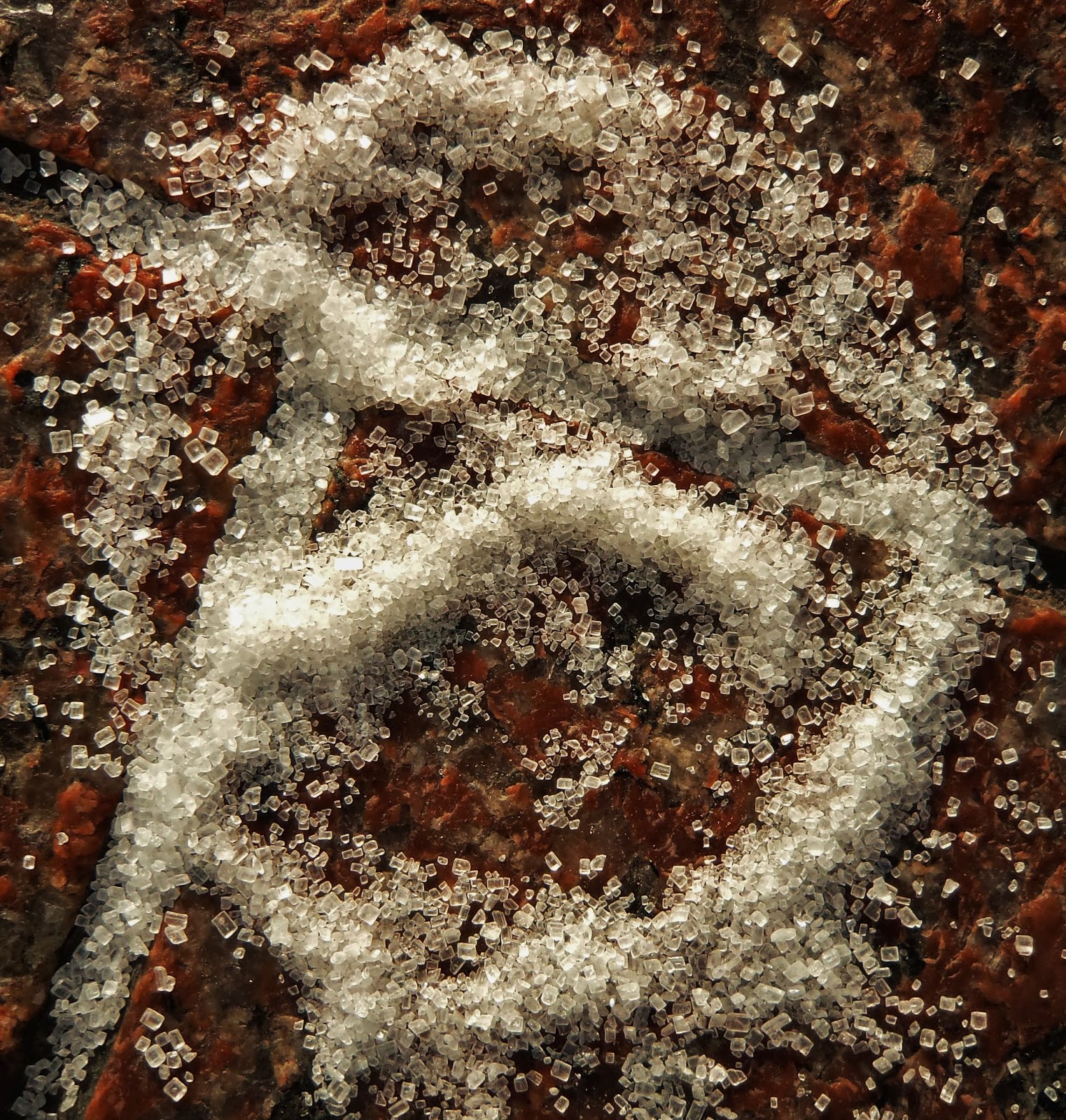
Here the theme was SAD so I attempted to create a sad face with some sugar on the floor.

The theme here was FALLING, I saw an image of 'buzz light-year' from toy story and remembered the classic line where he states that he is not flying but: 'falling with style', so I thought this was relevant.

When looking for an image to represent ECHO, I struggled however this image here involved the repetition of the blue circles and repetition is a key aspect of the echo so out of everything I found I thought that this was the most successful way of representing echo in the short time period which we had.

The theme here was CRUSH, so when I saw 'ironman's' strong wrist clenched as if crushing something I thought it represented the theme perfectly.

Here the theme was HAPPY, this I found was a very easy theme to represent because a lot of advertising has happy faces such as on the dancers here.
REFLECTION
This day started off well being introduced to photography which I have always enjoyed but never studied to a detailed degree, so much of this day involved learning new things which helped me understand photography much better. I quickly realised that I liked busy photos with lots to look at especially in the panorama form. This panoramic form is much similar to the lengthy image you see in cinema, this is a technique I would like to take further into a lot of my work because it is not too common and is really visually impressive. My sketch was successful in that I completed it so quickly and my sketching skills at speed have improved rapidly so far over this process. However it was not perfectly accurate but there is plenty of time to improve this aspect of my artistic skills. Looking into cropping and the meaning behind photos was very intriguing and I have definitely learnt a lot more which should help improve my photos to the next level. Then when capturing photos trying to represent a certain theme was interesting because it makes you look at the world in a new light really searching for something in your surroundings. In this topic I am only a rookie at the moment but there is plenty of time and space to improve so I will keep trying my best and see how it goes.
 
Images: Authors own
 
CHC 

GRAPHICS POSTER

WEEK 5 DAY 3

Using what we had learnt about graphics in terms of faces and text in the previous two days, the task was now to combine them in order to create a poster of our possible future involved in graphics. 

There were many different ways people went about completing this task using various media and different levels of simplicity.

Basic colour and recognisable shapes were very bold ways of covering space on the composition.

The combination of text and image are often very successful in that it is such a simple formula but it gives the eye enough to look at and to be interested by.

I liked this because it is very bold black on white however the introduction of the linear colour adds a sense of depth to the piece- something I would like to incorporate into my future work.

Using pens and permanent markers is a very slow process when covering the majority of an A2 size poster so I didn't manage to finish my poster within the set time.

I focused heavily on completing the typography of my poster during the set time using a basic black/ white colour scheme.

Above are my initials against the black/ white stripes of colour in the background. Depending on the colour of the background I adapted the letters or parts of the letters to contrast the background. At the end it means there is not a definite colour for the whole of the text but a varying colour scheme to contrast which is something I admire and would use again.

This is my finished poster, I feel I successfully replicated a similar style to that of the 'King Krule' '6 feet beneath the moon' album cover. I love the contrast which a simple black and white colour scheme creates. Although perhaps additional colour would really bring out another aspect helping to improve the tone or general impressiveness of the poster.

I edited the poster on the computer looking at how the poster would look in different colours. I only used a simple windows editor so I need to get hold of 'Photoshop' to really boost the successfulness of my editing. Another aspect of this piece I like is that it is not so obvious what it is but when you look at it long enough you can realise what it shows.

REFLECTION
This was an enjoyable task, I enjoy creating posters and would consider any project like this to be in favour of the set of skills that I possess. Looking at other peoples work again opens your mind to new processes and ways of going about making the poster. Essentially I chose a plain and simple method of carrying out this task with the black and white colour combination; so in future I plan to make it more complex and visually powerful through the inclusion of colour in the design. I think the strongest part of my piece is the text which is very neat in comparison to the fairly rugged colouring of the body, face and suite that I have adopted. I feel that I have successfully made recognisable objects such as the 'Oscar turned V&A award' with messy black pens toning creating an almost shimmering shining effect between the hands. Another thing I would like to try is a different media such as charcoal on a larger scale when doing a poster in black and white. My main aim for next time I carry out a task similar to this I will probably use paint for rich colour or computer programmes for neatness and precision.

Images: Authors own

CHC


Wednesday, 2 October 2013

GRAPHICS: TEXT

WEEK 5 DAY 2

A quick task carried out here involved creating letters from the strangest possible ways, finding connections which would not usually be made for example the letter 'p' created by creases in the paper on the image above.

Using charcoal and drawing an impression of various objects under the paper created strange patterns and formations, I outlined the letters 'k' and 'm'.

Chucking pens at the pens and drawing using my little finger only created some interesting shapes, a '20' is just visible highlighted lightly with the green.

Grabbing a fist full of pastels and scribbling led to the creation of many letters.

Here I tore bits of the paper which created a 'w' which I then highlighted in blue.

Using scissors I sliced across the paper randomly then highlighting certain tears with green pastel. 

Here is a more messy piece where I just stuck down random things including charcoal chippings on glue which created an 'm'. On the right describes the methods I used (in blue) or could have used (in red) in this process.

I thought my charcoal impression technique was the strongest; so increased the scale to give me enough shapes to highlight with red pen in order to generate a whole alphabet's worth of letters.

I liked the seletape circles impression under charcoal so I further adapted this circular shape to create another alphabet based entirely on the curves of a circle.

After, I looked at a graphic text book and was inspired by various typefaces so I photocopied a few then using a light box I started to trace over the necessary letters in order to complete my idea. This is incomplete but when finished will have my initials clearly at top with my DOB below then below 'methodical'- one of my defining characteristics.
I finished the piece later using fine line pens. I feel that it is generally strong but could still be improved for example, the 'c' could be neater as a curve and the leaves could look more like leaves.

REFLECTION
At first this appeared to be a simple task which essentially it is however when you look at it from a more profound aspect, you realise the true depth of the thought and amount of invention that goes into the process of developing a font. I feel I created some strange ways to create shapes that could be letters however I feel that potentially I could be more inventive with stranger ideas in the future which should help generate more originality. Today I used the tasks well to experiment thoroughly, delving into texts new and strange. Using this experimentation as a base I would like to further enhance my skills creating text simply through practice. I really like how imagination and out of the box thinking is a key part of the creative process which has been heavily emphasised to me so far this week and I am striving to use my imagination skills as much as possible in the future.
 
Images: Authors own.
 
CHC